FAMILY PORTRAITS · COLOR GUIDE
Family Portrait Color Schemes That Work
Color schemes do more for a family portrait than any specific outfit choice. Get the palette right and a $30 thrift-store sweater photographs as well as a $300 silk blouse. Get it wrong and even the most expensive coordinated wardrobe falls flat on camera.
As a working South Shore family portrait photographer based in Rockland, the question I get most often during planning calls is some version of “what colors should we wear?” Below are the exact palettes I recommend across every season — paired with the South Shore locations they work best at: Duxbury Beach, World's End in Hingham, Wompatuck State Park, the Cohasset coastline, and the Rockland studio. The goal isn't matchy-matchy uniforms. It's a coordinated palette that lets every family member's personality come through while reading as one cohesive group on camera.
The Two Principles That Govern Every Family Palette
Principle 1: Coordinate, don't match. Three to four colors that complement each other beat everyone in identical shirts every time. Matching outfits flatten the group into a unit; coordinated palettes let each family member read as an individual who belongs to the same cohesive whole. The visual difference on camera is dramatic — coordinated families look like a portrait, matched families look like a team photo.
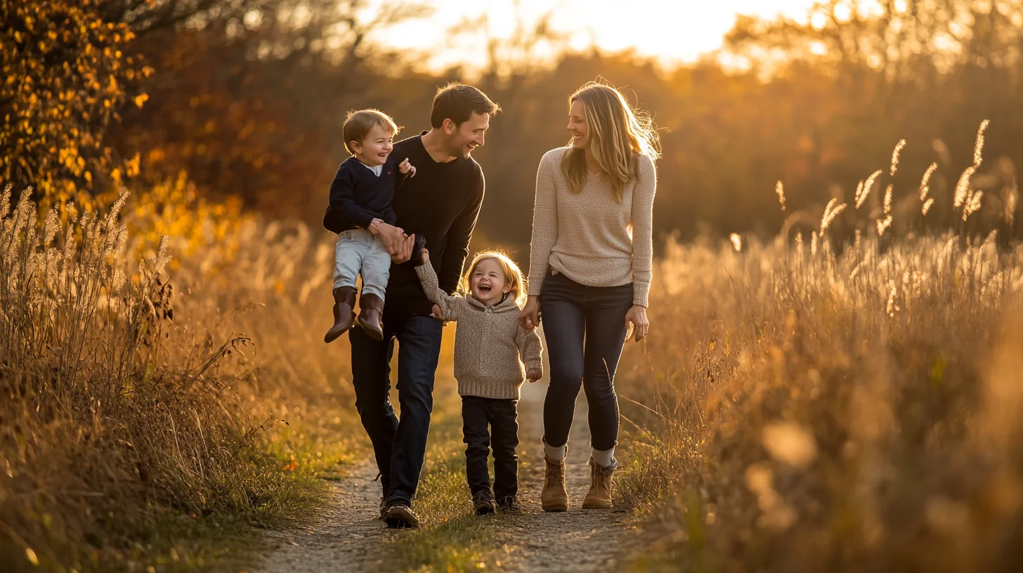
Principle 2: The location is part of the palette. Duxbury Beach in late afternoon is amber and pale blue, so a navy/cream/warm-tan family blends beautifully into that environment and reads as intentionally composed. The same family in those colors at a winter Wompatuck setting — bare grey trees, overcast sky, brown leaf litter — would feel cold and washed out because the palette was built for a different backdrop. Every palette recommendation below is location-aware for exactly this reason.
The practical framework I use is the 60-30-10 rule: 60% anchor color across two family members, 30% complementary color on a third, 10% accent on the fourth or in accessories. A family of four wearing navy (mom's dress, dad's shirt), cream (daughter's top and skirt), warm tan (son's chinos and casual jacket), and a single rust-colored accessory — a scarf, a headband, a belt — hits all three bands perfectly. This gives variety without chaos, and it lets you build the palette around what people already own rather than buying new outfits from scratch. For full outfit guidance beyond color, see the companion post on what to wear for family portraits on the South Shore.
Beach and Coastal Palettes
Scituate Harbor · Duxbury Beach · Cohasset Rocky Beach · Hull · Hingham Bathing Beach
“Salt & Sand” (cream, navy, soft denim, warm tan). This is the workhorse coastal palette — it works at every South Shore beach in every season because it mirrors the colors already present in the environment: the cream of the sand, the navy of the Atlantic, the sun-bleached tan of driftwood and beach grass. A mom in a cream linen dress, dad in navy chinos and a soft-washed button-down, a daughter in soft denim, and a son in warm tan shorts and a cream shirt gives you the full palette across the group. No one is wearing the same thing; everyone looks like they belong together.
“Driftwood” (camel, charcoal, oatmeal, burnt orange accent). This palette is spectacular at golden hour at Duxbury Beach and along the Cohasset shoreline in late afternoon light. The warm amber tones of camel and burnt orange pick up the color of low sun on sand and water in a way that cooler palettes simply can't. Charcoal grounds the palette and prevents it from reading as too warm or washed out against a bright sky. The burnt orange accent — a scarf, a cardigan layered open — creates the 10% pop that makes the finished images feel styled rather than accidental.
“Storm” (slate blue, dove grey, white, copper accent). This palette works beautifully on overcast or moody days at Scituate Harbor and the Cohasset rocky coastline — when the sky and water are grey-blue and the rocks are dark and wet. The slate and grey harmonize with the environment rather than fighting it, and the copper accent (a belt, a bag, a pair of earrings) prevents the palette from reading flat.
What to skip on coastal sessions: pure white (blows out in bright sun and creates harsh contrast against the family members not wearing it), neon brights (they fight the natural palette of the beach and date quickly in prints), and all-black (flattens against a bright open-sky background and adds a formality that feels wrong on a sand dune). For more on planning a coastal session, read the full beach family portraits guide.
Fall Foliage Palettes
World's End · Wompatuck State Park · Whitney-Thayer Woods · Norwell Town Forest
“Harvest” (rust, mustard, deep teal, ivory). This is peak-fall-foliage palette territory — October and early November at World's End in Hingham and along the carriage paths at Wompatuck. The rust and mustard echo the oranges and yellows in the canopy; the deep teal provides the complementary contrast that makes those warm tones pop; and ivory keeps the palette from becoming too heavy. This is the palette that produces the fall family portraits you see on holiday cards, and it works because every color in it is already somewhere in the landscape.
“Cabin” (forest green, oatmeal, brown leather tones, plum accent). This palette works in late fall — after peak color has dropped and the landscape shifts to bare branches and brown leaf litter in November and December. Forest green and brown leather tones feel intentional against a late-fall landscape rather than out of place, and oatmeal keeps the palette from going too dark. The plum accent is a rich jewel tone that reads beautifully in soft late-fall light.
“October Light” (camel, cranberry, bronze, soft cream). This palette is built specifically for the warm amber quality of golden hour light through turning leaves in early-to-mid October. Camel and bronze pick up the warm tones in the light itself; cranberry provides the jewel-tone pop; and soft cream anchors the palette without competing with the foliage behind the family. Cranberry and cream on two family members, camel and bronze on the other two, gives you the full range.
What to skip in fall: red and orange together (they compete with the foliage rather than coordinating with it — the family disappears into the background instead of reading in front of it), and pastels (they read as spring tones against an autumn backdrop, creating a seasonal dissonance that undermines the entire image).
Fall family portraits photograph so well on the South Shore because the landscape does part of the color work for you. The amber and rust already in the frame create a warm surround that flatters virtually every skin tone and makes even simple clothing choices read as beautifully composed. The palettes above are designed to work with that environmental warmth rather than against it. For timing, locations, and full planning details, see the dedicated fall family portrait tips guide.
Winter Palettes
Rockland Studio · Wompatuck Snow · Hingham Bathing Beach in January
“Winter Berry” (deep cranberry, cream, charcoal, warm tan). This palette works for both indoor studio sessions and snow-on-the-ground outdoor winter sessions because it reads rich and warm against both a neutral studio backdrop and a white-and-grey winter landscape. Cranberry and charcoal provide the jewel-tone depth that winter light flatters; cream and warm tan keep the palette from reading too heavy or formal. This is also a strong holiday-card palette — the cranberry reads festive without being explicitly themed.
“Hearth” (rust, cream, dark brown, soft pine green). Cozy, warm, and holiday-card-ready without being explicitly seasonal. This palette works at the Rockland studio against warm neutral backdrops and outdoors at Wompatuck when there's snow on the ground — the rust and pine green read as warm against white and grey winter backgrounds. Dark brown grounds the palette and prevents it from tipping into holiday cliché. Think cable-knit sweaters, layered scarves, and warm textures.
“Coastal Winter” (slate blue, oatmeal, camel, white). For outdoor coastal sessions in January and February at Hingham Bathing Beach or Scituate Harbor. Winter coastal landscapes are all slate, grey, and white — bare beach grass, flat light, cold open water. Slate blue and oatmeal harmonize beautifully with that palette, and camel adds warmth so the family doesn't disappear into a grey-on-grey image. This is the palette for families who want a moody, dramatic winter portrait rather than a cozy holiday-card look.
Winter family portrait sessions at the Rockland studio benefit from richer, deeper colors because the soft window light flatters jewel tones in a way that bright outdoor midday light does not. When you control the light source, you can use colors — deep cranberry, forest green, charcoal, rich burgundy — that would compete with a busy outdoor background but read with quiet confidence against a clean neutral studio backdrop.
What to skip in winter: pastels (they read summery against bare landscapes and look tonally wrong against snow), pure black on every family member (it flattens the group and removes visual variety), and neon brights (they fight the muted winter landscape and date the images quickly).
Spring Palettes
Cohasset Common in Dogwood Bloom · Plymouth Waterfront · Hingham Square
“Garden” (sage green, blush, cream, soft butter yellow). This palette was built for Cohasset Common in April and early May when the dogwood and cherry trees are in bloom. Sage green anchors the palette and echoes the new-growth foliage; blush picks up the pink tones in the flowering trees; cream and soft butter yellow keep the palette light and airy. This combination works beautifully in the soft, diffused light of overcast spring days — which is actually some of the most flattering light for family portraits.
“Linen” (oatmeal, soft white, dusty blue, pale rust accent). A versatile spring palette that works across multiple South Shore locations — the Plymouth waterfront, the green paths of Hingham Square, and the open fields at Wompatuck in May. Oatmeal and soft white read as naturally casual; dusty blue adds the cool-tone balance that prevents an all-warm palette from feeling heavy; and pale rust is a warm accent that bridges the cool and warm tones in the rest of the palette.
“Bloom” (lavender, dove grey, soft cream, warm tan). Lavender paired with dove grey is a combination that reads almost universally beautiful against Cohasset Common's spring flowering trees in late April. The cool purple tones of lavender harmonize with the soft pink and white blooms; dove grey grounds the palette without darkening it; soft cream and warm tan keep the palette from skewing too cool or purple-heavy.
What to skip in spring: oversaturated brights (they compete with the fresh color already in the environment), all-cream families (they wash out in the soft spring sun and lose definition against light-background blooms), and heavy fall tones like rust and mustard (they create a seasonal dissonance against green new growth and spring flowers). The spring family portraits guide covers location-specific timing for bloom season across the South Shore.
Studio Family Portrait Palettes
83 E Water Street, Rockland MA
Studio sessions tolerate a wider color range than outdoor sessions because you control the lighting and the background. There is no competing foliage, no bright open sky, no ocean horizon — the backdrop is neutral, the light is shaped to flatter, and the colors in the frame are entirely the family's. That control opens up palette options that would be too bold or too dark for an outdoor setting.
“Editorial” (charcoal, cream, soft camel, deep burgundy). This palette reads with quiet confidence against the studio's neutral grey and warm backdrops. Charcoal and cream provide the high-contrast anchor; soft camel adds warmth; and deep burgundy is the jewel-tone accent that elevates the palette from casual to intentional. This combination produces the kind of family portraits that get framed rather than printed in wallet size.
“Family Classic” (navy, cream, denim, soft tan). Timeless, approachable, and completely cross-generational — grandparents and toddlers both look at home in this palette. It reads beautifully against any studio backdrop choice and is the easiest palette for families to assemble from what they already own. Navy shirt on dad, cream blouse on mom, denim jacket on a child, soft tan on another — done. This is the palette I recommend to families who are coming in stressed about wardrobe and need a reliable answer.
“Holiday Card” (deep green, cream, burgundy, soft gold). Built specifically for late-season studio sessions — October through December — when families want images that double as holiday card material. The deep green and burgundy read festive without being explicitly themed; cream keeps the palette from feeling heavy; and soft gold in accessories or a scarf adds a warm finish. This palette photographs beautifully under the studio's warm window light and produces images that look deliberate rather than themed.
The broader principle for studio palettes: richer and deeper colors work better in a controlled studio environment than they do outdoors, because the studio light is designed to bring out depth in dark tones rather than wash them out the way bright midday sun does. Colors that would disappear or fight with an outdoor background — deep burgundy, forest green, charcoal — read with quiet confidence against a clean neutral studio backdrop. For the complete planning resource covering locations, timing, and wardrobe by season, read the complete guide to family portraits on the South Shore.
Frequently Asked Questions About Family Portrait Color Schemes
Do all family members need to wear the same colors?
No — and they shouldn't. The most successful family portraits use a palette of three or four colors distributed across the family, not the same outfit on everyone. The 60-30-10 rule (60% anchor color across two family members, 30% complementary color, 10% accent) gives you variety without chaos and lets each person's personality come through.
What's the single most flattering color for family portraits on the South Shore?
Navy is the closest thing to a universal flattering color across skin tones, ages, and South Shore locations. It reads beautifully against beach, foliage, and studio backdrops; pairs cleanly with cream, camel, soft white, denim, and rust as accents; and almost everyone in the family probably already owns something navy. If you're stuck, build the palette around navy.
Should we coordinate with the season or with the location?
Both, ideally — the two usually align. A fall family session at World's End calls for harvest tones because the season AND the foliage at that location both lean amber and rust. A winter session at the Rockland studio calls for richer, deeper jewel tones because the studio's window light flatters them and bright outdoor color is no longer in the frame. When season and location pull in different directions, prioritize the location.
Can we mix patterns or do all our outfits need to be solids?
One pattern per family is the rule that almost always works. Pick a small-scale pattern (a striped sweater, a soft floral, a check) and let everyone else wear solids that pull colors from the pattern. Two or more patterns in the same group portrait usually competes with the family itself and makes the frame feel busy.
PRO TIP
“The single fastest way to test your family palette before the session: lay every outfit out on a bed and step back six feet. If it reads as one cohesive group, you're set. If one outfit jumps out as a different palette entirely, swap it. The bed test takes ten minutes and saves the entire gallery.”
Planning a South Shore Family Session?
Family portrait sessions across Duxbury, Hingham, Scituate, Cohasset, Norwell, and Rockland book quickly — reach out to check availability for your preferred season and location.

ABOUT THE AUTHOR
Chris McCarthy is a portrait photographer based in Rockland, MA who has been photographing the South Shore full-time since opening his studio in 2014 — more than a decade of outdoor and lifestyle portrait work across the region. He specializes in headshots, senior portraits, branding, family, and maternity photography — shooting at his studio at 83 E Water Street and on-location throughout southeastern Massachusetts at places like World's End, Scituate Harbor, Duxbury Beach, and the North River conservation land in Norwell.
More from the Blog
STYLE GUIDE
What to Wear for Family Portraits
A full style guide for South Shore family sessions — from outfit choices by season to what to avoid and why.
POSING GUIDE
Family Portrait Posing Guide
The poses that actually work for South Shore family sessions — from toddlers to grandparents, beach to forest.