PHOTOGRAPHY BASICS · COLOR
White Balance and Color Temperature for Portraits — When Auto Works and When to Override
South Shore Photography, based in Rockland, MA, serves clients across Hingham, Scituate, Norwell, Duxbury, Marshfield, Cohasset, Hanover, Weymouth, and Plymouth. Photographer Chris McCarthy works primarily in natural outdoor light — and white balance is one of the fundamentals that separates consistent, professional-looking portraits from images where the color is just slightly off without anyone being quite able to say why.
White balance is one of those camera settings most beginners ignore until something goes obviously wrong — and then it becomes all they can think about. I've been shooting portraits outdoors across the South Shore for years, and I still make deliberate white balance decisions on every single session. Not because auto white balance is bad (it isn't), but because understanding when to override it is the difference between images that need significant color correction in Lightroom and images that look right straight out of camera. This post covers what white balance actually is, how the Kelvin scale works, when to trust auto and when to take over, and how creative white balance choices can shape the entire mood of a portrait.
What White Balance Actually Is
Camera sensors have a fundamental limitation that human vision doesn't: they can't automatically interpret the color of light. When you look at a white piece of paper under warm afternoon sun, your brain performs an unconscious adjustment and sees white. A camera sensor just sees reddish-orange and faithfully records it as reddish-orange — unless you give it a reference point.
White balance is that reference point. You're telling the camera: under this light, here is what neutral white looks like. Once the camera has that anchor, it shifts the entire image — pulling colors toward blue or orange as needed — so that whites appear white, neutral grays appear gray, and skin tones render accurately rather than as the orange or blue-tinted versions the raw sensor data would produce without correction.
The challenge is that different light sources have dramatically different color characteristics. Late afternoon sun runs warm — lots of red and yellow energy. Open shade on a clear day skews blue, because you're lit by scattered skylight rather than direct sun. Overcast light is flat and slightly cool. Tungsten bulbs glow intensely orange. Each of these requires a different correction to produce a “neutral” result. And sometimes neutral isn't what you want — but more on that later.
The Kelvin Scale — Understanding Color Temperature
Color temperature is measured in Kelvin (K), borrowed from physics. The counterintuitive part: lower Kelvin values are warmer (orange/yellow); higher values are cooler (blue). This trips up almost every beginner, but it makes physical sense — think of metal in a forge glowing orange at lower temperatures, then white-hot, then blue-white at extreme temperatures.
The practical range for portrait photography:
- 2500–3200K: Tungsten and incandescent bulbs — very warm, orange. Candlelight and older household bulbs live here.
- 3200–4000K: Early morning and late afternoon sun — warm but not yet golden hour intensity.
- 4500–5500K: Midday sun — roughly neutral daylight. The baseline your camera's Daylight preset targets.
- 5500–6500K: Overcast and cloudy sky — flat, slightly cool light.
- 6500–8000K: Open shade — cool, noticeably blue-tinted. Lit by sky rather than direct sun.
- 8000–10000K: Heavy overcast, deep shade, twilight — very cool and distinctly blue.
When you set your camera to 5500K, you're telling it: I'm shooting in neutral midday light — render colors as they actually are. When you set 3200K in that same outdoor sun, you're telling the camera the light is much warmer than it actually is — so it overcompensates by adding blue, producing a cool, editorial-looking image. The Kelvin value you set doesn't describe the light. It describes what you want the camera to assume about the light.
When Auto White Balance Works — and When It Fails
Auto white balance (AWB) on modern cameras is genuinely capable. Under consistent, single-source outdoor light — clear midday sky, open shade, overcast — AWB produces accurate, pleasing results the majority of the time. For the outdoor portrait sessions I run across Hingham, Scituate, Norwell, and Duxbury, AWB handles most situations without intervention. If you're just starting out, AWB is the right default.
But AWB has predictable failure modes worth knowing by name.
Mixed light. Stand a subject half in direct sun and half in open shade, and AWB gets confused — it picks a compromise balance that looks wrong for both zones. The only real solutions are to move the subject into one consistent light source or lock in a manual white balance that favors whichever source dominates the frame.
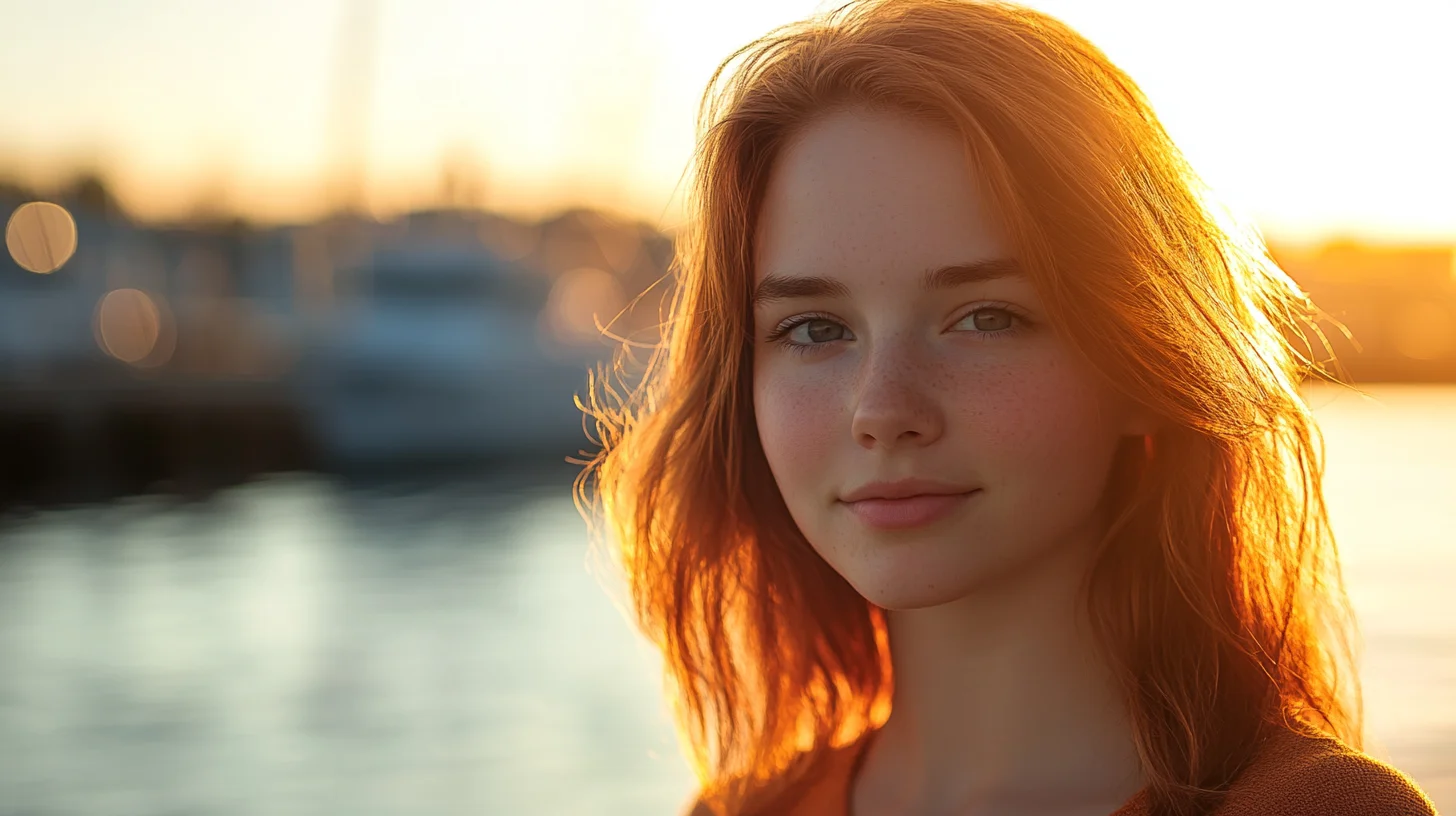
Sunsets and golden hour. This is the AWB failure that frustrates portrait photographers most. You've timed a session for golden hour at Hingham Harbor specifically for that warm, honeyed light. AWB recognizes the orange and adds blue to compensate, stripping exactly the quality you showed up for. I've seen stunning sunset light reduced to a bland, beige-tinged result because AWB did its job. At golden hour, lock in a manual Kelvin value or use the Cloudy preset and let the warmth live in the image where it belongs.
Indoor tungsten light. Standard incandescent bulbs run around 2700–3000K. If your camera is set to Daylight or AWB doesn't fully compensate, everyone in the room looks orange. I encounter this at nearly every wedding reception I photograph — the hall looks beautifully warm to the human eye, but without a Tungsten preset or custom Kelvin, the camera records faces as an unnerving shade of amber.
Fluorescent light. Older fluorescent tubes produce a green-tinged cast that AWB often doesn't fully correct. If you've photographed someone under gym lighting or older office tubes and wondered why their skin looks greenish, uncorrected fluorescent light is your answer. The Fluorescent preset addresses it, though modern LED-based replacements vary widely and often respond better to AWB or a custom setting.
White Balance Presets — What Each One Actually Does
Every camera offers white balance presets. Here's what they do in practical terms rather than just icon descriptions.
Daylight (sun icon, ~5200–5500K): Assumes neutral midday sun. Produces accurate, balanced color in direct outdoor light. My default starting point for outdoor portrait sessions — everything else is relative to this baseline.
Cloudy (~6000–6500K): Adds warmth relative to Daylight. Useful on overcast days — flat gray skies run cool and can make skin tones look slightly washed out. Cloudy compensates and produces more natural-looking results. I also use it as a subtle warming effect on sessions where the light is nice but I want a slightly richer, more intimate feel without going all the way to the Shade preset.
Shade (~7000–8000K): Adds significant warmth. Open shade is very blue — lit by scattered skylight rather than direct sun — and this preset compensates aggressively. For sessions under tree canopy along the North River in Norwell or on the shaded side of a building in Scituate, Shade produces noticeably more flattering skin tones than Daylight or AWB.
Tungsten (lightbulb icon, ~2850–3200K): Designed for incandescent bulbs — adds heavy blue compensation to neutralize that orange cast. Using Tungsten outdoors in daylight creates an intentionally very cool, blue-toned image. Some photographers do this deliberately for a cinematic effect. Used accidentally outdoors, it makes everything look like a scene from a thriller.
Fluorescent (~4000K with green shift compensation): Addresses both the color temperature and the green cast of older fluorescent tubes. Modern LED-based fluorescent replacements vary widely — worth testing before relying on this preset in an unfamiliar space.
Flash (~5500K): Matches the color temperature of most speedlights and studio strobes. Essential when mixing flash with ambient daylight to keep the two sources consistent and avoid mismatched color zones in a frame.
Setting Custom White Balance and Dialing Kelvin
For maximum accuracy, two methods beat presets in most real-world situations.
Gray card white balance is the most precise approach available to a working photographer. Photograph a neutral gray card — or a white ExpoDisc, or even a white piece of paper — in the actual light of your shooting location. Navigate to your camera's custom white balance menu and set it from that image. The camera calculates exactly what shift is needed to make the gray appear neutral and applies that same correction to every subsequent frame. Setup time: about 60 seconds. When I'm shooting at a reception venue with complex mixed lighting, this is how I start.
Manual Kelvin entry is faster and more flexible once you develop an eye for it. I use this constantly — I'll take a test shot, find a white element in the frame (a shirt, a napkin, the ground), and dial the Kelvin value up or down until white reads neutral on my LCD. In a tungsten reception hall I might land around 3200–3400K. Under mixed LED and window light, maybe 4500K. You can also deliberately skew 200–500K away from accurate to get a specific look — a controlled creative decision rather than a committed preset.
The key benefit of either custom method over presets: consistency across an entire session. Lock in a specific Kelvin value for a location and every image from that setup shares the same color rendering. Syncing one correction across 200 frames in Lightroom takes seconds. Correcting each one individually takes an afternoon.
Creative White Balance — Using Color as a Storytelling Tool
Everything above is about accuracy — using white balance to render colors as they “really” are. But accuracy isn't always the goal. White balance is also one of your most expressive tools for shaping the emotional tone of a portrait session.
Warming beyond accurate — setting a higher Kelvin than the light source actually calls for — makes images feel warmer, more intimate, more golden. I do this for late afternoon sessions when the light is pleasant but not yet at golden hour intensity. Setting 6500K in actual 5500K daylight adds a gentle warmth that reads as intentional rather than corrective. Applied consistently across a session, that warming choice shapes the mood of the entire gallery.
Cooling below accurate — setting a lower Kelvin than the light source — pushes images toward blue and silver tones. This is the editorial look you see in fashion and lifestyle photography: cool, sophisticated, slightly cinematic. On an overcast session at Duxbury Beach, pushing cool intentionally produces a moody, contemporary feel that works beautifully for certain clients and aesthetic directions. Used accidentally it just reads as cold and clinical.
The distinction is intent. When I make a deliberate creative white balance decision to warm a golden hour session or push an overcast session cooler, I'm making a choice that serves the image and the client's aesthetic. When AWB makes that choice for me — particularly when it strips warmth from a gorgeous sunset over Hingham Harbor — I've handed over one of my most expressive tools. That's the real cost of leaving white balance entirely on auto.
RAW Shooters: White Balance Is Effectively Free
If you shoot RAW — and if you're serious about portrait photography, you should be — white balance is a non-destructive, fully reversible adjustment in post-processing. The RAW file captures full sensor data without baking in a color interpretation. When you open it in Lightroom or Capture One, the white balance value is just metadata. Slide the temperature and tint sliders anywhere you want, with no loss of image quality at all.
This means a missed white balance in the field is not a disaster when shooting RAW — you can correct it completely in post. But there are still good reasons to set consistent white balance while shooting.
First, consistency. If your white balance drifts across a session because AWB is making different decisions frame to frame, you'll spend time matching corrections across hundreds of images rather than applying one sync. Second, accuracy in the field. Reviewing properly white-balanced images on your camera's LCD gives you a true read of the scene — you can judge color, skin tones, and mood accurately and make better decisions about exposure and composition in real time.
The hierarchy of in-field priorities: nail exposure first, white balance second. Blown highlights or crushed shadows have real limits — no amount of editing fully recovers them. White balance in RAW is essentially free to fix. But “free to fix” is not the same as “not worth getting right.” Consistent color in the field means faster editing and better real-time creative feedback during the session itself.
JPEG shooters don't have this safety net. White balance is baked into the processed file, and while Lightroom's temperature slider still works on JPEGs, you're adjusting already-processed data in a way that can introduce color artifacts at the extremes. This is one of the strongest practical reasons to switch to RAW if your camera supports it — you keep every creative option open after the session ends.
Frequently Asked Questions
Will auto white balance ruin my photos?
Not in most situations. AWB works well for consistent outdoor lighting — clear sky, midday sun, open shade. Where it causes problems is mixed light, golden hour, and indoor tungsten. In those cases AWB either gets confused or actively strips warmth you came for. Use AWB as your starting point and override it whenever the lighting is unusual or particularly warm. If you shoot RAW, a wrong AWB call is easy to fix in post, so the stakes are lower than they used to be.
Why do indoor portraits look orange?
Standard incandescent and tungsten bulbs emit very warm light — around 2700 to 3200 Kelvin. If your camera's white balance is set to Daylight (5500K) or AWB doesn't fully compensate, the camera records that warm orange cast faithfully rather than correcting for it. The fix is your camera's Tungsten preset (the lightbulb icon) or a custom Kelvin value dialed in around 2800–3200K to match the light source and neutralize the orange.
Should I worry about white balance if I shoot RAW?
RAW files treat white balance as non-destructive metadata — you can change it freely in Lightroom or Capture One with no quality penalty. That said, setting consistent white balance in the field still makes editing faster and gives you an accurate real-time preview on your LCD. If forced to prioritize, nail exposure first — that has real limits. White balance in RAW is essentially free to fix, but consistent in-camera color is always the better workflow.
What Kelvin setting should I use for golden hour portraits?
For golden hour portrait sessions on the South Shore, I typically start around 5500–6000K — this preserves most of the warm tones the late light provides without letting AWB neutralize them. For a more intentionally warm, honeyed look I'll push to 6500–7000K. The exact number depends on how warm the actual light is that session: golden hour in October on Hingham Harbor looks different from golden hour in July. I dial it in by eye from a test shot and lock it in from there.
What white balance preset is best for overcast days?
The Cloudy preset (typically 6000–6500K) is my go-to for overcast sessions at Duxbury Beach, Scituate Harbor, or anywhere on the South Shore under flat gray skies. Overcast light runs cool and can leave skin tones looking slightly washed out. Cloudy adds warmth to compensate and produces more flattering, natural results. In heavy overcast or deep shade, the Shade preset (7000–8000K) adds even more warmth and is often the better choice.
PRO TIP
“The most common white balance mistake I see isn't leaving it on auto — it's leaving it on auto during golden hour. The camera works hard to neutralize exactly the warmth you showed up for. Lock in a manual setting at sunset and you'll spend half as much time pushing the temperature slider in Lightroom after the fact.”
Book a Portrait Session on the South Shore
Chris McCarthy photographs families, couples, and individuals in natural outdoor light across Hingham, Scituate, Norwell, Duxbury, and the wider South Shore — reach out to discuss a session.
PILLAR GUIDE
The Complete Guide to Photography Basics on the South Shore
This post is part of a broader series on photography fundamentals for South Shore photographers and curious clients. For the full overview — exposure, light, focus, composition, file formats, and more — read the complete pillar guide.
Complete South Shore photography basics guide →
ABOUT THE AUTHOR
Chris McCarthy is a portrait photographer based in Rockland, MA who has been photographing the South Shore full-time since opening his studio in 2014 — more than a decade of outdoor and lifestyle portrait work across the region. He specializes in headshots, senior portraits, branding, family, and maternity photography — shooting at his studio at 83 E Water Street and on-location throughout southeastern Massachusetts at places like World's End, Scituate Harbor, Duxbury Beach, and the North River conservation land in Norwell.
Continue learning the fundamentals
Each spoke of the basics guide goes deeper on one technical foundation. Read whichever one you need next.
COMPOSITION
Composition Fundamentals for Portraits
Rule of thirds, leading lines, framing — composition that makes a portrait feel intentional.
LIGHT DIRECTION
Natural Light Direction for Portraits
Front, side, back, top — how each direction shapes the face and what to choose when.
LENS CHOICE
Focal Length Basics for Portraits
Why 85mm flatters faces and 35mm tells a wider story — choosing focal length per shot.
BACKGROUNDS
Finding Clean Backgrounds on the South Shore
Where to look — and what to avoid — when scouting clean portrait backgrounds locally.
POSING
Basic Posing for Non-Models
How to direct everyday people so they look comfortable and natural — the language that works.
More from the Blog
SERVICE
Professional Headshots — South Shore
Color-accurate headshots for branding and corporate use →
SERVICE
Personal Branding Photography
Where consistent color across a deliverable set matters most →
PHOTOGRAPHY BASICS
The Exposure Triangle Explained for Beginners
How aperture, shutter speed, and ISO work together — and how to use all three to take real creative control of your camera.
CAMERA SETTINGS
RAW vs JPEG: Which Should You Shoot?
The real difference between RAW and JPEG files — and when each format is the right choice for your photography and workflow.